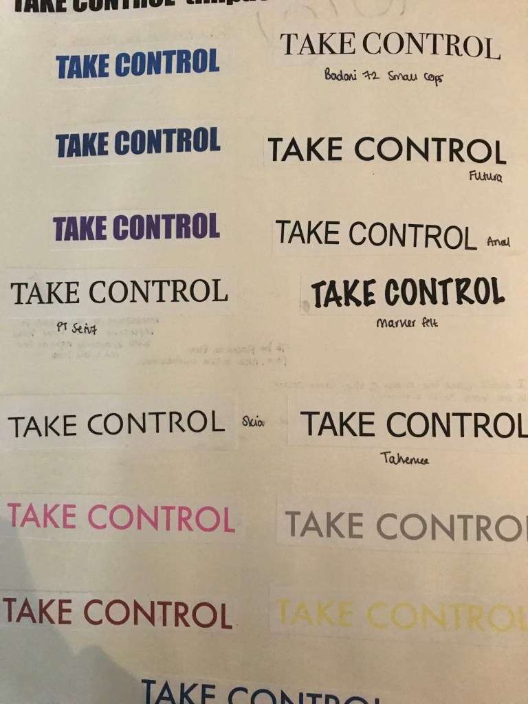
Font plays a very important role in creating my book. I want the book to look formal but also look quite personal. I want it to have a welcoming look to it and not a book where you turn the page and immediately put it down once you turn to the front page. Laying out the different fonts helped me come to a conclusion of what font I wanted to select. I don’t want the font to be continuously be changing but have some consistency to it. Also looking at the font gave me a chance to choose the right colours and boldness of it. I found that I liked the noteworthy font because it looks like someone has written a diary and that the book isn’t too serious which is what I want. I would want a student to sit and feel relaxed by every element in the book, including its font. I also liked the headings of each page to be in the font ‘Impact’. I like how bold it is and also it looks like the best option when put next to the noteworthy font. When I printed it out and stuck it in to my book it was helpful because I was able to directly look at the font of paper and really decide which one would fit both the theme and style of my book. I think to enhance my work, if I had given myself more time when looking at the font I would have combined my research of the different fonts that I liked and created one for my book. This way it would have been a combination of all the fonts that I liked.
Once I had chosen my fonts, put them onto indesign and printed them off I was pleased with the result. I chose Noteworthy because it almost reminds me of a diary and the writing you would keep in a journal. In some ways its also looks quite calming as if the book isn’t too serious and you can read it whenever. Its not just a book that you would pick up in the library and read but one that you could read before bed or wherever you are. To conclude, before picking my final font it was important to compare other fonts in case I was drawn to another one and also sometimes the font you choose can clash with the illustrations you have created, however I felt like there was a good contrast between serious and more relaxing features in the book.