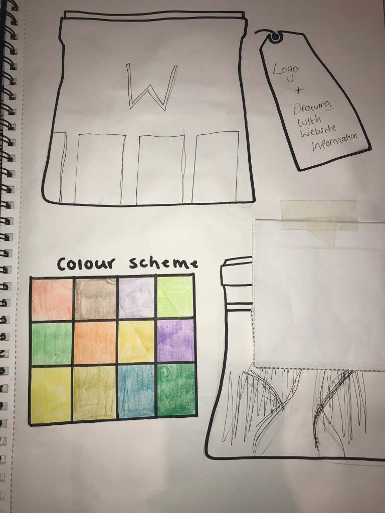
When looking at the logo, we all began by sketching out a number of different ideas, given a briefing of what the client wanted the logo to look like previously. We then judged each others work and chose which logo would be best suited. I found this method of choosing a log really useful as it was interesting to see the different opinions and other people take on the brand as well. Although it was slightly challenging because there was a chance for your favourite logo not to be chosen. However it was important to keep in mind that other peoples judgement of your work is just as important as your own, especially when creating for a brand thats not yours.
Once I had an idea of what was most liked, I then used Illustrator to create the logo. This was quite easy as visually I already had an idea of what the logo would look like and just needed to figure out whether I wanted to add colour to it. I wanted to keep it simple and easy to read as I feel that a lot of logos are best when they’re kept short and simple. Using illustrator to create different versions of my logo was helpful as I was then able to refer back to them when choosing my final logo to place on the packaging.
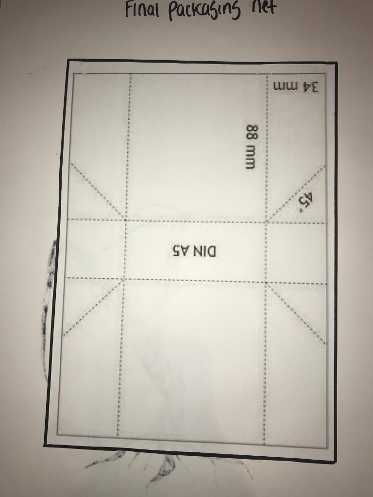
In terms of packaging, using the research I had previously done, I chose not to create packaging that I had seen be repeated multiple times and so looked at different nettings for packagings online. Once I had a few nettings I began to prototype. Creating prototypes was so important because if I hadn’t created them then I wouldn’t have realised which netting I wanted and didn’t want for my final product. In the end, once I had sketched a few different packaging ideas, I chose one that to begin was quite challenging to fold and figure out how to put together.
If I was to change anything, I think I would’ve focused on the design aspect on the packaging more and so could’ve handled my time management better, however overall I was pleased with the amount of research and prototyping I had produced.