I created four different mood boards all displaying the atmosphere, target audience, logo research and brand research. By making these, I was able to establish what would be best for the brand and also what it reflects. This helped the group when presenting as we were able to have the key parts that make up a company.
Once we had established all of these, we were then able to choose the company we would like to work with. It was easy to agree on a specific company as because we had previously already discussed what we felt about past decisions made, we were all on the same page when deciding the company as we felt that Ikea best reflected the Library of things.
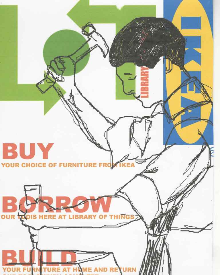
When creating this poster it helped me with my skills with softwares. To create the illustrations and put the poster together I used the software Illustrator. I was able to learn how to create different layouts and used different tools to draw and also put fonts together. I was able to be expressive with the illustration but also experiment with different colours. In the end I decided to stick with the colours that are a part of the logo because it works the best and too many colours would distract you from the purpose of the poster. I was happy with the outcome as we wanted it to be quite simple and easy to understand, however I do feel like it looks a bit rushed, I think if I could change anything I would change the background and incorporate the IKEA logo into the poster better as I feel like it looks quite hidden behind the illustration. Also you can’t really see ‘The Library of Things’ logo which is an obvious problem. Therefore there is a lot of room for improvement but being able to use the software helped with my digital drawing skills.