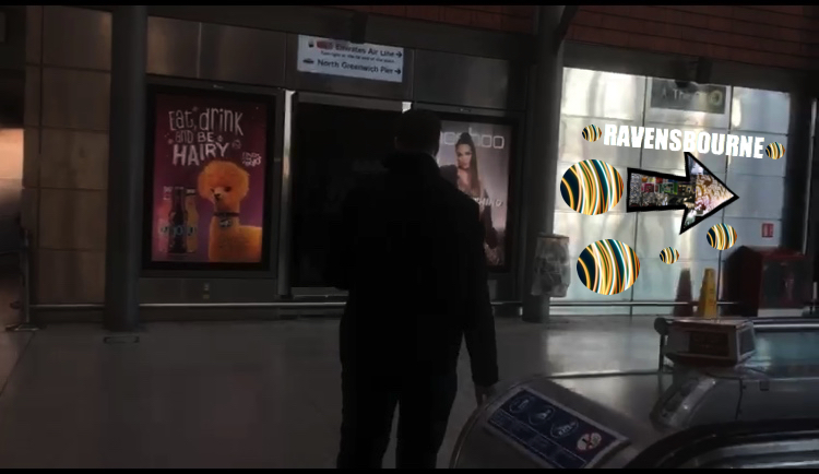
We were successfully able to come up with a few small edits that led unto our super graphic. We wanted it to be very clear where ravesnbourne was and so we thought having three different directions could help make it clear. We incorporated the arrows into our small directions leading unto the super graphics.
I was quite disappointed with the actual super graphic, I think if I had more time or could change anything I would make the multicoloured arrows look more realistic like they are stuck on the ground and not hovering above. I would use photoshop to accomplish this.
Originally we wanted to have our moving image on the wall of the station, but just as a mock up so people could be aware, I incorporated what was placed on the escalators onto the wall. I remembered when creating our way finding sign to get to Ravensbourne, how important colour was in the process so we tried to make everything as colourful and as bold as possible so even from a distance you would be able to see the signs.
Also if we had more time, I would crate my moving image using photoshop, just to give it a more animated feel and to contribute to this work, making it stronger.![]()