The project set was to create a slogan using your own font for a campaign that you’re creating. To begin with this research I used both physical and online resources to help me get to my final piece. The research was extremely helpful as without the process itself I wouldn’t have been able to get to the end, but it was also useful to recognise other Artist work, get some inspiration and try to apply it to my final piece. It was interesting to see the variety of different fonts I found. This helped me broaden the ideas I already had and also gave me inspiration for some new ideas for my campaign.
Down below are a few examples of some of the research that I did which contributed to my final piece, and also includes some images from my sketchbook showing my thought process and a mind map of a few of the different ideas I had.
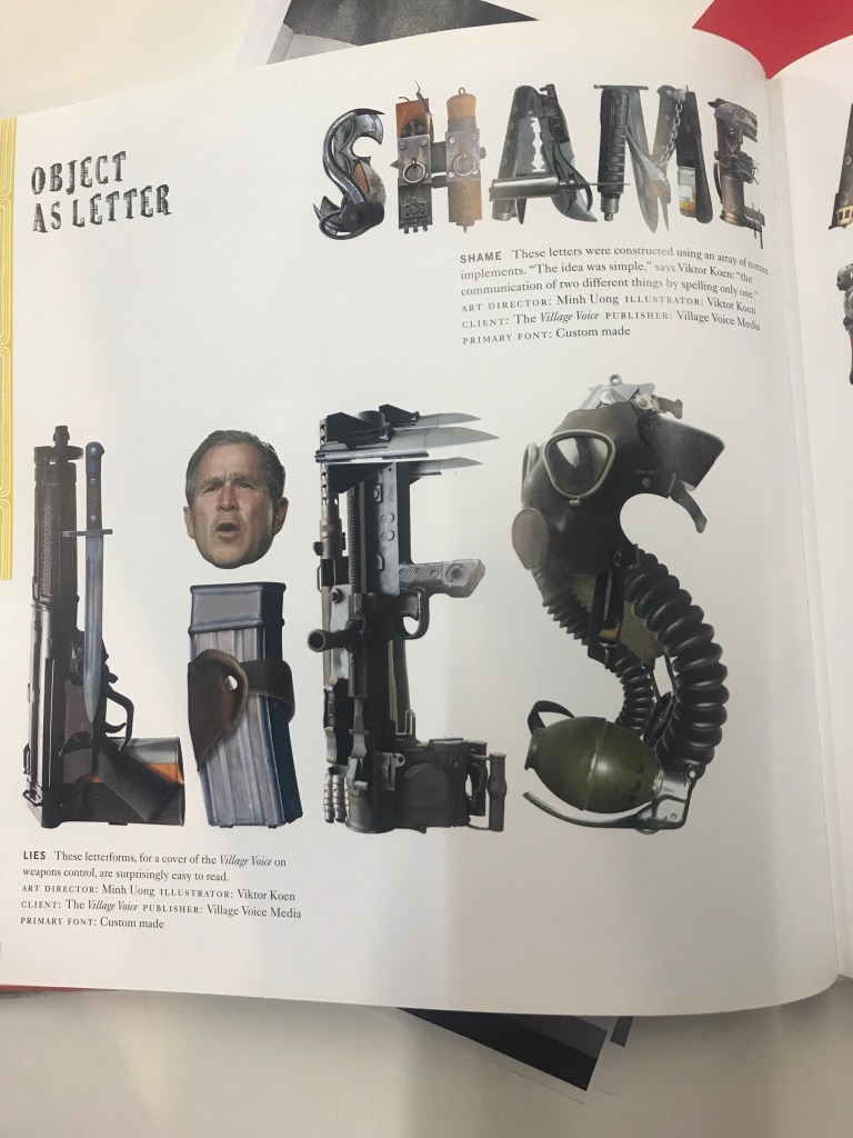
Using the resources in the library, I was able to find a few different fonts which I found appealing. I didn’t have a complete idea of what I wanted my campaign to be about but looking at these different fonts for research before moving onto creating the fonts was beneficial. It was interesting to see how letters and words could be spelled out using physical objects and could still provoke emotion or at least give you an idea about what the inspiration behind the word was. The research I did was beneficial for me as it helped me keep an open mind about the different types of resources I could use to create my font. With this font I particularly like the use of materials to create the word ‘LIES’.
 I decided to look at this font because of the expressiveness of it, I like how the words are moving around freely. Although I didn’t have a set idea of what I wanted to accomplish at the end of the project, expression was something I was interested in looking into and later this creative font helped me get to my final piece.
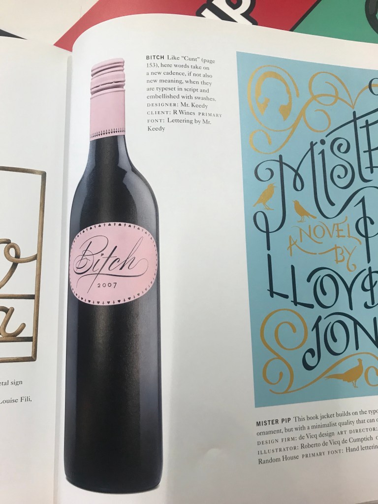 This font was different in a sense that the font is very elegant but its message is not, I liked the contrast between the message and the font and how the Artist has very cleverly used the font to make the word ‘Bitch’ seem like a compliment.
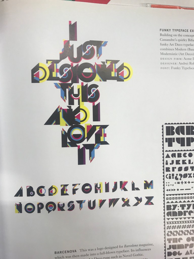 I liked the merge of colours within this font. How there are no limitations of colour and it’s a bit distorted. The colours were a great influence of using bold colours for my final piece as it creates an energetic and chaotic atmosphere.
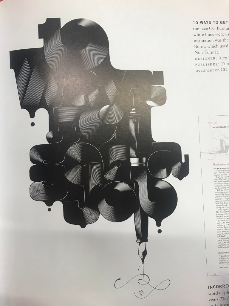 This font caught my eye because of the intense tones. I thought it was quite clever how the ink pen is leaking at the bottom of the page and this font is quite bold and expressive which also helped contribute to my final piece later on.
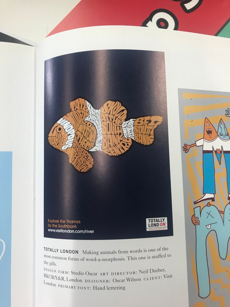 I really liked how the words had been put together to create an image and the colours have also been carefully considered to create a certain type of fish. Also the layout of the font and how its been placed onto a dark background to make it more visually appealing. The font is quite big and although its pressed together, it is still easy to read which is important for any font.

To begin with my research, I brainstormed a variety of different ideas that could lead to my possible final outcome. The task set was to come up with a protest campaign that you feel passionately about. Taking the valuable information I gained from previous projects, naturally the first thing I did was create a brainstorm of ideas so that I wouldn’t be left with one simple idea, but have different options. For some more of my research I was looking at different types of fonts I could use that compliment the theme nature. I started by experimenting with real plants and tried to create words with them. However the obvious reason why I didn’t go through with it was because it would eventually die and become distorted. I looked at fonts that could look like plants digitally as well and also practised with an ink pen to see if I could recreate the font with a pen.
