This task required us to look around ravensbourne and out of the university for different types of lettering from A-Z and even numbers 0-9 if we could. For this task I focused on making sure the fonts were quite different in comparison to one another. To begin, the task was easy because everything was written differently, however towards the end when I was looking for letters I found that the words and letters around the O2 had a lot of repetitive style, just bold, vivid and big letters to catch your attention. One letter that I found hard to find was the letter ‘J’. I didn’t realise how this letter really isn’t used that much in everyday wording and so this was a difficult one to find. Overall I was pleased with myself because within the space of time we were given, I was able to find all the letters and so completed the task successfully. If I had slightly more time, I think I would try to look for words that were all completely different and didn’t have the same bright colours or bold style as a lot of the restaurants were similar in style.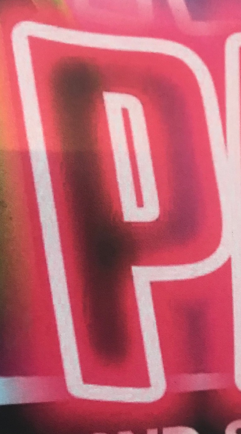 I chose this ‘P’ because I was drawn towards the neon pink which was relevant because the poster was from a neon themed party. I like how the white outline is placed against the black background to make the neon colours stand out more. The neon pink looks like fog and creates an energetic atmosphere.
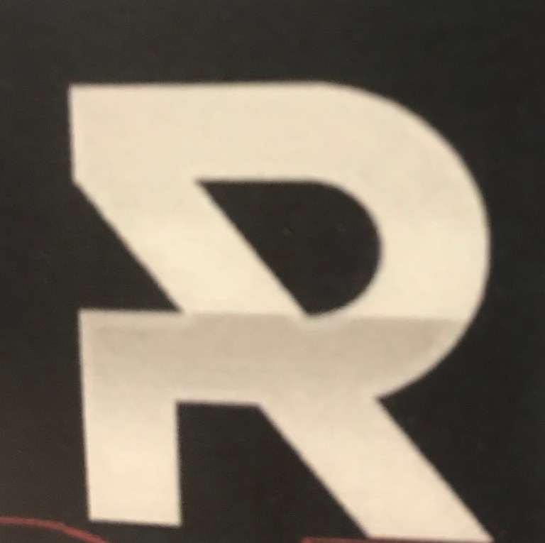 This ‘R’ is very simple, with a white on black theme. I thought the way the R had been written was quite clever, I also liked the simplicity of the lettering. Its very clear what letter this is and it also looks very modern to fit the times.
 I was drawn to this ‘Z’ because it had lightbulbs within the lettering which created bright lights to attract you to the restaurant. It gives off a very warm and welcoming vibe and the font itself isn’t basic. It has its own flare to it which makes it unique. I also think placing it on a dark background to make the letters brighter and clearer was a good idea.
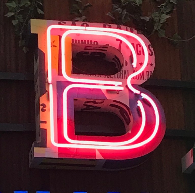 I was attracted to the way different light has reflected off of this letter. There are a variety of different colours that spring from this letter. I like how its 3D and the light has come from outlines within the letter, which produces the light or when it gets dark. It also looks like two fonts in one. One of the fonts is more playful and the other font is more firm and bold.
- Comment
- Reblog
-
Subscribe
Subscribed
Already have a WordPress.com account? Log in now.
